Data analysis have been made on the walmart data using the Microsoft Power BI tool for data visualization, where the different features of the walmart data are viewed with various powerful graphs. Power-BI is considered as a far most powerful visualization tool when compared to matplotlib or seaborn, because we can able to interact with the dashboards, with the help of which more insights can be obtained from the data.
Let's consider the dataset, where the order id of the particular order, the ship date of the order, the customer name, other details of the customer name such as where he lives in, his region, the sales index about the customer and the order he purchases, then the quantity of the order, and the overall profit for the particular order.
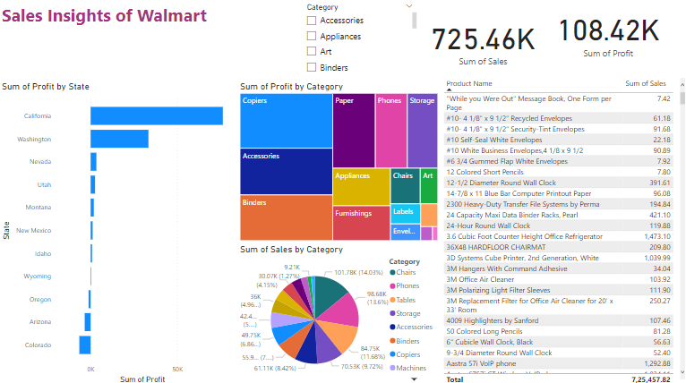
To start with the visualization, two card charts are created based on the sales and the profit, and followed by which the profit obtained by the walmart based on the category of item it solds to its customer are shown in a Treemap.
A Bar Chart is also shown which visualises the Profit by State.
And overall all the visualization have been made over the dataset, and finally one slicer is created, for the category, and if we alter the slicer we can see that there is an impact over all the other charts, so concluding this PowerBI is a very powerful tool for data visualization and very user friendly.
The dashboard which is created using power-bi is present in the Sales_insights_of_Walmart.pbix file.
The dataset of the walmart store is present in Walmart.xlsx file.
A sample image of the dashboard is stored as Dashboard.png image.
- Easy to use.
- Helps organize data.
- Customize your dashboard.
- Offers many built-in analytics.
Clone the project
git clone https://github.com/Vedakeerthi/Walmart-Sales-Analysis.gitInstall dependencies
Install Power-BI applicationOpen the dashboard
Just double click on the dashboard (Sales_insights_of_Walmart.pbix) file and open it in power-bi application.