A lightweight, customizable React component for rendering skeleton loaders while content is loading.


- Lightweight & customizable
- Built-in pulse animation
- Supports circle and rectangular shapes
- Easily stylable via
classNameandstyle
npm install react-skeleton-loaders
yarn add react-skeleton-loaders
import React from 'react';
import Skeleton from 'react-skeleton-loaders';

const MyComponent = () => {
  return (
    <div>
      <Skeleton width="100%" height="20px" />
      <Skeleton width="60%" height="20px" style={{ marginTop: 10 }} />
      <Skeleton circle width="40px" height="40px" />
    </div>
  );
};
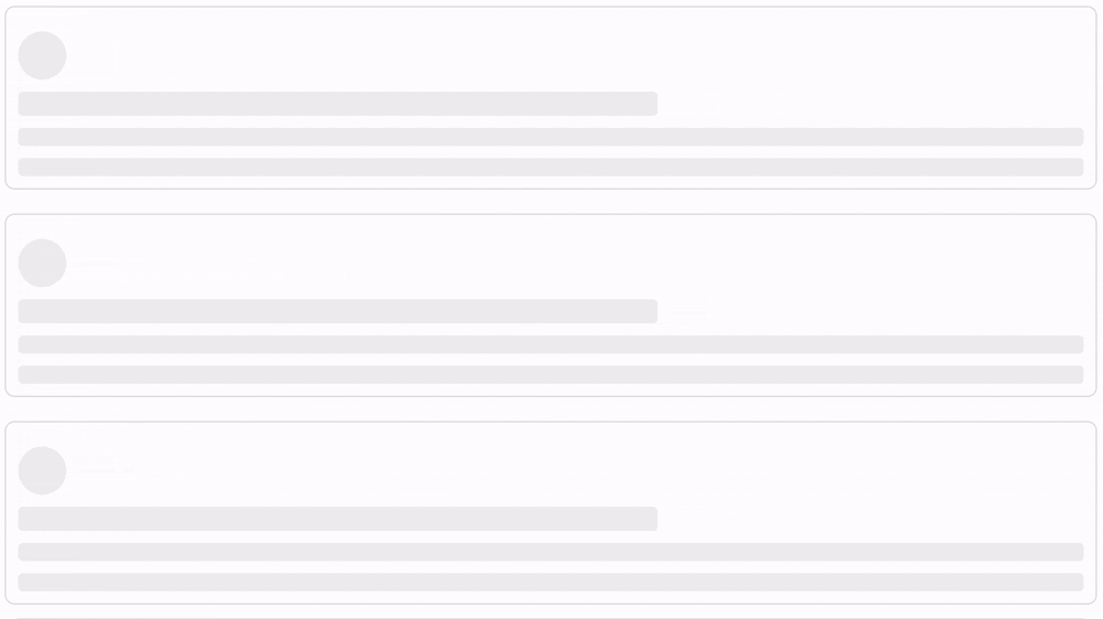
import React from 'react';
import Skeleton from 'react-skeleton-loaders';

const App = () => {
  const posts = [1, 2, 3, 4, 5, 6];

  return (
    <div style={{
      display: 'grid',
      gridTemplateColumns: 'repeat(auto-fill, minmax(500px, 1fr))',
      gap: '20px',
      margin: '10px',
    }}>
      {posts.map((post, index) => (
        <div key={index} style={{ padding: '10px', border: '1px solid #ddd', borderRadius: '8px' }}>
          <Skeleton circle width="40px" height="40px" />
          <Skeleton width="60%" height="20px" />
          <Skeleton width="100%" height="15px" />
          <Skeleton width="100%" height="15px" />
        </div>
      ))}
    </div>
  );
};

export default App;
| Prop | Type | Default | Description |
|---|---|---|---|
width |
string | number |
"100%" |
Width of the skeleton |
height |
string | number |
"1rem" |
Height of the skeleton |
circle |
boolean |
false |
Renders as a circle |
className |
string |
"" |
Custom class for styling |
style |
React.CSSProperties |
{} |
Inline styles |
npm run build
MIT License © Victor Olayemi